Grammar?
A set of rules describing how to compose a 'vocabulary' into permissible 'sentences'
The R language has its own grammar
"Grammar of Graphics" is an abstraction describing how to create rich and informative plots
'The Grammar of Graphics', Leland Wilkinson
Embodied in the ggplot package for R
'A Layered Grammar of Graphics', Hadlay Wickham, Journal of Computational and Graphical Statistics, 2010
R’s base graphics supports some plotting commands
E.g. plot(), hist(), barplot()
Extending these standard graphics to custom plots is tedious
ggplot is much more flexible, and pretty
Install like you’d install any other package:
install.packages('ggplot2') library(ggplot2)
Why a grammar?
View different graphs as sharing common structure
Grammar of graphics breaks everything down into a set of components and rules relating them.
Rather than viewing an images as a 'thing' views it as a sequence of transformations applied to data.
This abstraction avoids
- limiting yourself to what standard canned packages do
- hacking through the graphics rendering engine
The components of a graphic are orthogonal:
- changing one shouldn’t break the others
- different settings of components are valid (if not sensible)
- You can build complexity by adding more layers
The grammar represents what we do with the data
- Plotting is part of understanding rich datasets
- Having understood the structure of a graph, we might ask: what if we do this instead of that?
ggplot: R implementation of GoG
Components of ggplot ’s grammar of graphics:
One or more layers:
- Data and aesthetic mappings
- A statistical transformation
- A geometric object
- Position adjustments
- A scale for each aesthetic
- A coordinate system
- A facet specification
Plotting in base R
library('ggplot2')
str(diamonds)  # diamonds is a dataset from ggplot
plot(diamonds$carat, diamonds$price)
diamonds_loc <- diamonds[sample(50000,10000),]
ggplot() +
  layer(
    data = diamonds,
    mapping = aes(x = carat, y = price),
    geom = "point", stat = "identity",
    position = "identity" ) +
  scale_y_continuous() + scale_x_continuous() +
  coord_cartesian()
Of course, ggplot has intelligent defaults:
ggplot(diamonds, aes(carat, price)) + geom_point()
There’s also further abbreviations via qplot
(I find this confusing)
Layers
ggplot produces an object that is rendered into a plot
This object consists of a number of layers
Each layer can get own inputs or share arguments to ggplot()
Add another layer to previous plot:
ggplot(diamonds, aes(x=carat, y = price)) + geom_point() +
geom_smooth()
Different layers and their components
Data and aesthetic mappings:
ggplotrequires a dataframe as input- this layer maps columns of input to aspects like x,y-coordinate, size, color etc
reshape2andtidyrpackages useful to get data in the right format
mix2norm <- data.frame(x = c(rnorm(1000),rnorm(1000,3)),
                 grp = as.factor(rep(c(1,2),each=1000)))
ggplot(mix2norm, aes(x=x, color = grp)) +
    geom_density(adjust=1)
A statistical transformation
A summarization of the raw input
Example: binning, smoothing, boxplot, identity
Default: often identity (but see previous)
Specified via stat
ggplot(mix2norm, aes(x=x, color = grp, fill= grp)) +
geom_density(alpha=.4, adjust=1/2, size=2, stat="bin")
ggplot(mix2norm, aes(x=x, color = grp, fill= grp)) +
geom_density(alpha=.4, adjust=1/2, size=2, stat="bin") +
scale_color_manual(values = c("1" = "magenta", "2"="blue"))
A geometric object
The type of plot created
Specified via geom
According to dimensionality:
- 0-dim point, text
- 1-dim line
- 2-dim polygon, interval
geom_densityusesribbon
Others include geom_hist, geom_bar, geom_contour, geom_line
Can specify only geometry and not statistical transformation
ggplot(mix2norm, aes(x=x, color = grp)) +
geom_density(adjust=1/2)
Can change only statistical transformation but not geometry
ggplot(mix2norm, aes(x=x, color = grp)) +
stat_density(adjust=1/2)
Why does this look different? What are the defaults for
position and geometry?
ggplot(mix2norm, aes(x=x, color = grp)) +
stat_density(adjust=1/2, geom="line")
geom_density plots an object of geometry "ribbon"
Requires to specify both a y_max and y_min
library('tibble')
my_waves <- tibble(x=seq(0,6.28,.1),y1=sin(x),y2=sin(x)^2)
ggplot(my_waves) + geom_ribbon(aes(x=x,ymax=y1,ymin=y2))
ggplot(mix2norm ) +
    stat_density(aes(x=x, ymin=0, ymax=..density..,color = grp), adjust=1/2, size=2,
                 geom = "ribbon")
ggplot(mix2norm, aes(x=x, color = grp)) +
  stat_density(adjust=1/2, size=2, position = "identity",
  geom = "line")
Scaling
How each input value maps to the specified aesthetic
- Specified via
scale
Continuous, logarithmic, values to shapes, what limits, what labels, what marks
ggplot(mix2norm, aes(x=x, color = grp)) +
  stat_density(adjust=1/2, size=2, position = "identity",
  geom = "line") + scale_y_log10(limits = c(1e-5,1))
Coordinates
How positions of things are mapped to positions on the screen.
Different coordinates can affect the shape of geometric objects
Cartesian, polar, map-projection
ggplot(mix2norm, aes(x=x, color = grp)) +
  stat_density(adjust=1/2, size=2, position = "identity",
  geom = "line") + coord_polar()
Facets
Allows arranging different graphs in a grid/panel
ggplot(mix2norm, aes(x=x, color = grp)) +
  stat_density(adjust=1/2, size=2, position = "identity",
  geom = "line") + facet_grid(grp~.)
More examples
my_diamonds <- diamonds[sample(50000,5000,F),]
ggplot(my_diamonds, aes(x=carat, y = price,colour=cut)) +
  geom_point() +
  geom_line(stat= "smooth", method="loess",size=1, alpha= 0.7)
ggplot(my_diamonds, aes(x=carat, y = price,colour=cut)) +
geom_point() +
geom_line(stat= "smooth", method=lm, size=1, alpha= 0.7) +
scale_x_log10()+ scale_y_log10()
ggplot(my_diamonds, aes(x=carat, fill=cut)) +
geom_histogram(alpha=0.7, binwidth=.4, color="black",
position="dodge") + xlim(0,2)
- “Probably the best statistical graphic ever drawn, this map by Charles Joseph Minard portrays the losses suffered by Napoleon’s army in the Russian campaign of 1812. Beginning at the Polish-Russian border, the thick band shows the size of the army at each position. The path of Napoleon’s retreat from Moscow in the bitterly cold winter is depicted by the dark lower band, which is tied to temperature and time scales.” Edward Tufte, http://www.edwardtufte.com/tufte/posters
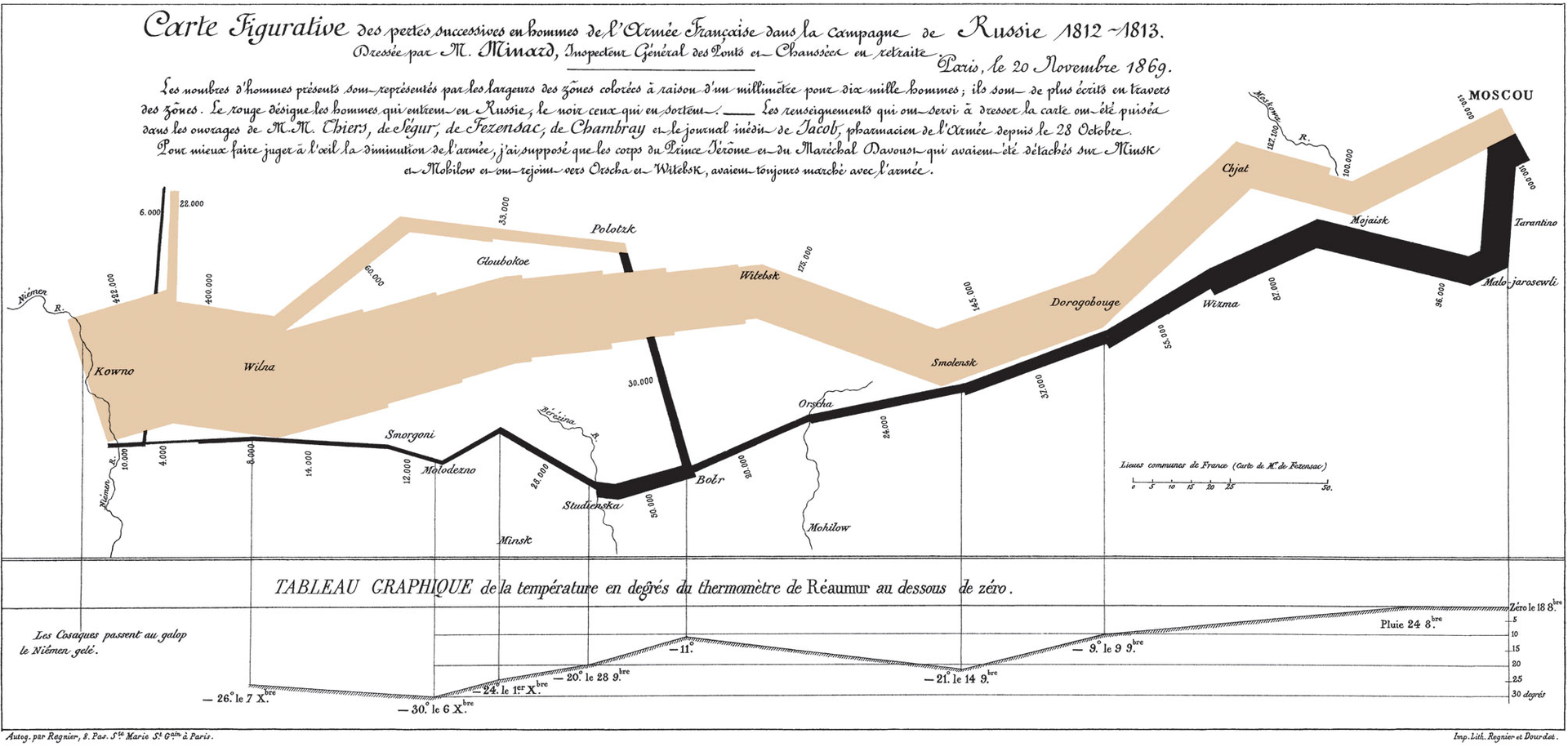
First read the data:
troops <- read.table("Data/minard-troops.txt", header=T)
cities <- read.table("Data/minard-cities.txt", header=T)
#  options(repr.plot.width=10, repr.plot.height=3)
plot_troops <- ggplot(troops, aes(long, lat)) +
  geom_path(aes(size = survivors, colour = direction,
  group = group))
plot_both <- plot_troops +
    geom_text(data = cities, aes(label = city), size = 3)
plot_both
plot_polished <- plot_both + scale_size(
   breaks = c(1, 2, 3) * 10^5, labels = (c(1, 2, 3) * 10^5)) +
   scale_colour_manual(values = c("grey50","red")) +
   xlab(NULL) + ylab(NULL)
plot_polished
Income dataset: http://www-bcf.usc.edu/~gareth/ISL/data.html
DataIncm<-read.table("Data/Income2.csv",header=TRUE,sep=",")
plt1 <- ggplot(DataIncm, aes(x=Education, y = Income)) +
          geom_point(size=2, color="blue") +
          theme(text=element_text(size=15)); plt1
plt1 <- ggplot(DataIncm, aes(x=Seniority, y = Income)) +
          geom_point(size=2, color="blue") +
          theme(text=element_text(size=15)); plt1
ggplot doesn’t support 3d plotting, but:
plt1 <- ggplot(DataIncm, aes(x=Seniority, y = Education, size=Income)) +
          geom_point(color="blue") +
          theme(text=element_text(size=15)); plt1
ggplot(DataIncm, aes(x=Education, y=Seniority, color=Income)) +
geom_point(size=2) + theme(text=element_text(size=10)) +
scale_color_continuous(low="blue", high="orange")
Further reading
‘A Layered Grammar of Graphics’, Hadlay Wickham, Journal of Computational and Graphical Statistics, 2010
ggplot documentation: http://docs.ggplot2.org/current/
Search ‘ggplot’ on Google Images for inspiration
Play around to make your own figures